Week 2: Decisions and Mockups
This week was all about jumping right in. I started by plotting out physical game levels. I then started sourcing assets and preliminary modeling. Lastly, I added materials, furnishings, and lighting.
Pre-Planning:
The game itself is a simple survival game with minimal environments. All game play happens in approximately 4 spaces:
The Library Lobby
The Study Area
The Basement Archives
The Labyrinth
I decided to plan these spaces as separate levels. This will help the spaces seem like different parts of a larger library, and help differentiate the environmental feel of each one.
I also initially sketched out a movement bubble map of where the player will travel to and through.
This informed the order of focus.
The level I focused on this week was: The Library Lobby
I sketched multiple layouts for the entryway/lobby but decided on a vast open concept. This is the first space the player will experience and feels the most modern. The further the player explores through the library, the more the entry feels like a stark contrast.
The “In-World” reasoning for this is, during university renovations it was decided only the area seen by the public was in need of renovation. Money was put into making the library appear modern, but the study rooms and book stacks were left untouched.
Next came modeling…
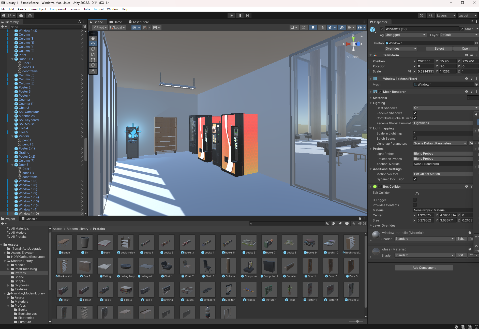
I opted to model the interior within Unity. Since the process was iterative and low fidelity, it was quicker and more flexible to use the geometry and assets within Unity itself.
This space, while one of the largest, is also relatively simple. The player will not spend a substantial amount of time in the entry, and therefore I opted to not prefab in another program.
The rough and quick construction allowed me to develop a space in detail easily. I was able to check the player perspective as I modeled, and review the placement and scale of Unity Marketplace assets within the rooms.


The lobby can visually be split into multiple spaces through architectural programming: the mudroom, the entry, the study foyer, the stairs, and the elevator nook.
The mudroom stands out/is separate from the rest as it will be a check point spot for the player.
Materials, Furnishings, and Lighting:
Materials are kept simple within this space - concrete, plaster, natural toned wood. This conveys a renovated and stereotypically modern look.
The furniture is sleek, geometric, and modular.
The lighting of the space will change over time, but the initial “setting” is a soft, lamp-lit feeling altered slightly by the harsh florescent strip lights. As this space is less interactive than others, I implemented mostly baked lightmaps, with a handful of mixed-lighting point lights.
Without people activity, the lobby may feel vacuous and cold. This feeling will be amplified as the lighting and furniture layout changes as the game progresses.


Next week I will be continuing mockups with the Study Area…
