Week 5: UI Wireframes and Mock Ups
Mockups and more mockups- This week I turned user interface plans to wireframes to visual mockups…
Months back, when this idea first came to me, I sketched out several quick layout plans.
These ideas were mainly for exploring the amount of space on a screen allocated to direction and interaction.
These sketches above now inspired what would become wireframes, but first I needed to determine what “pages” were most important.
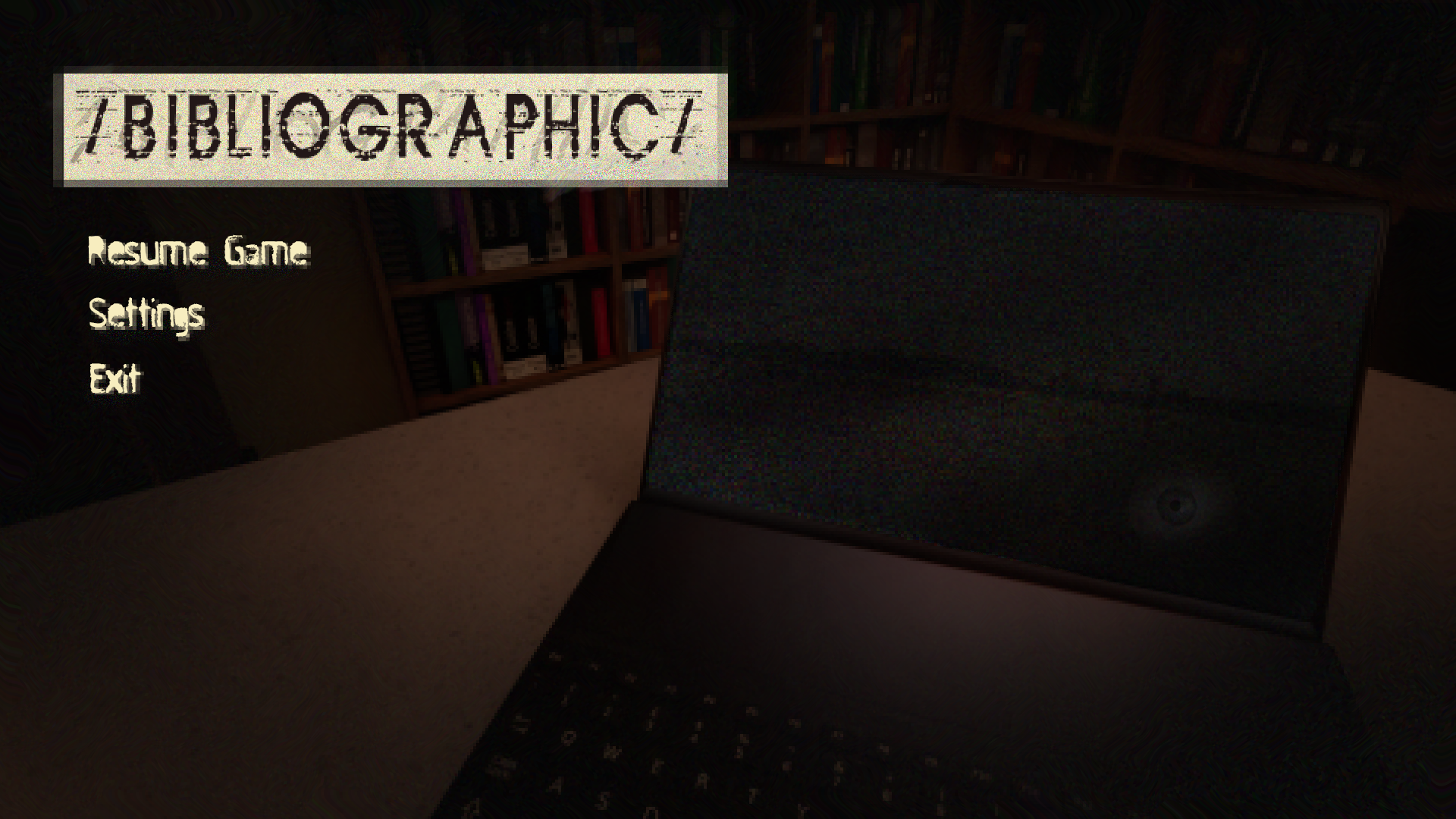
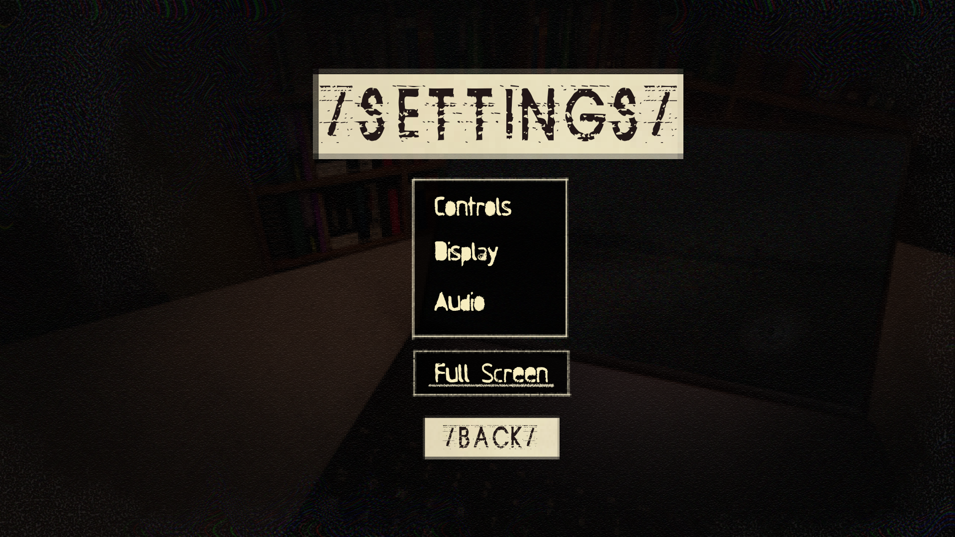
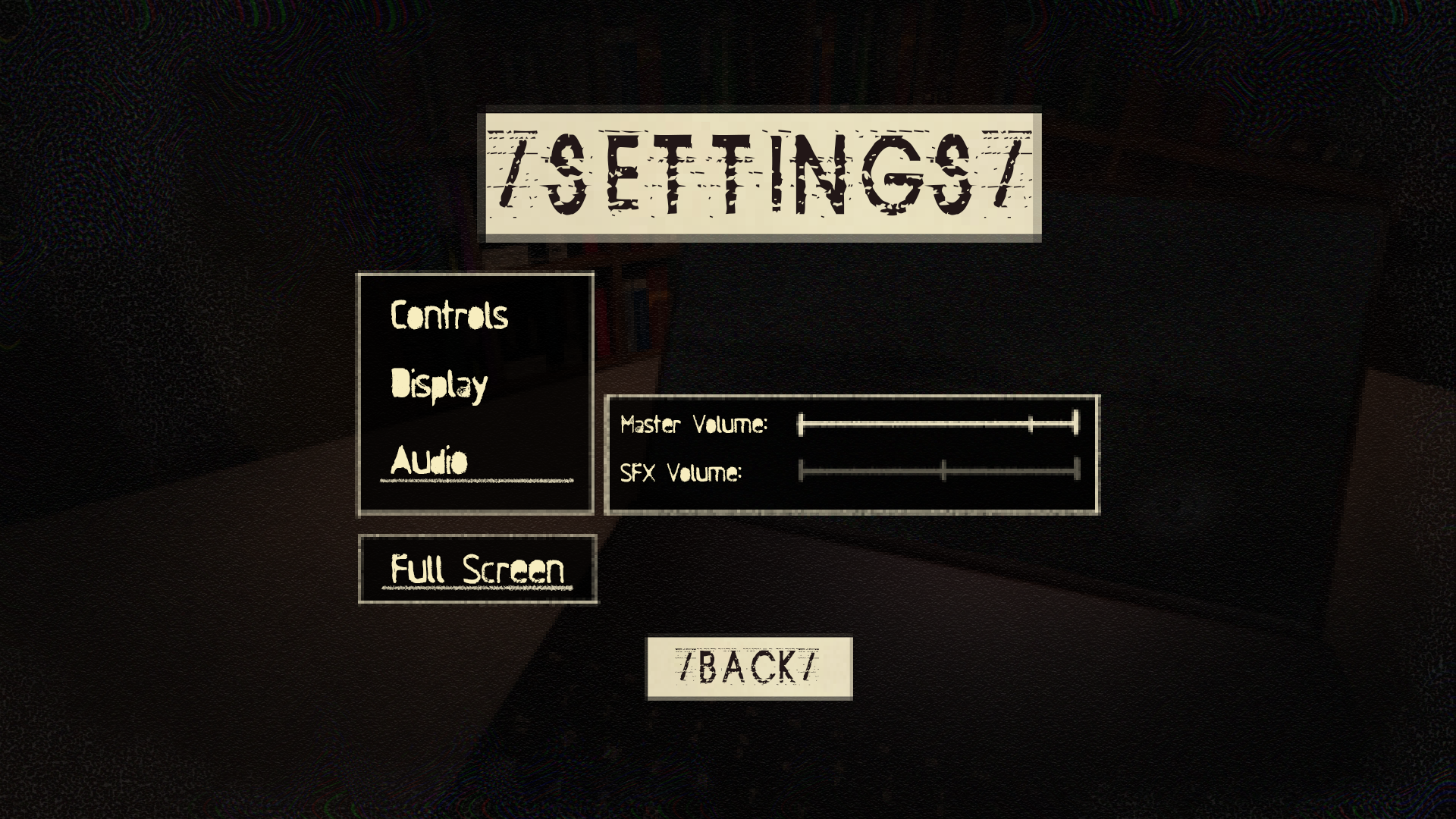
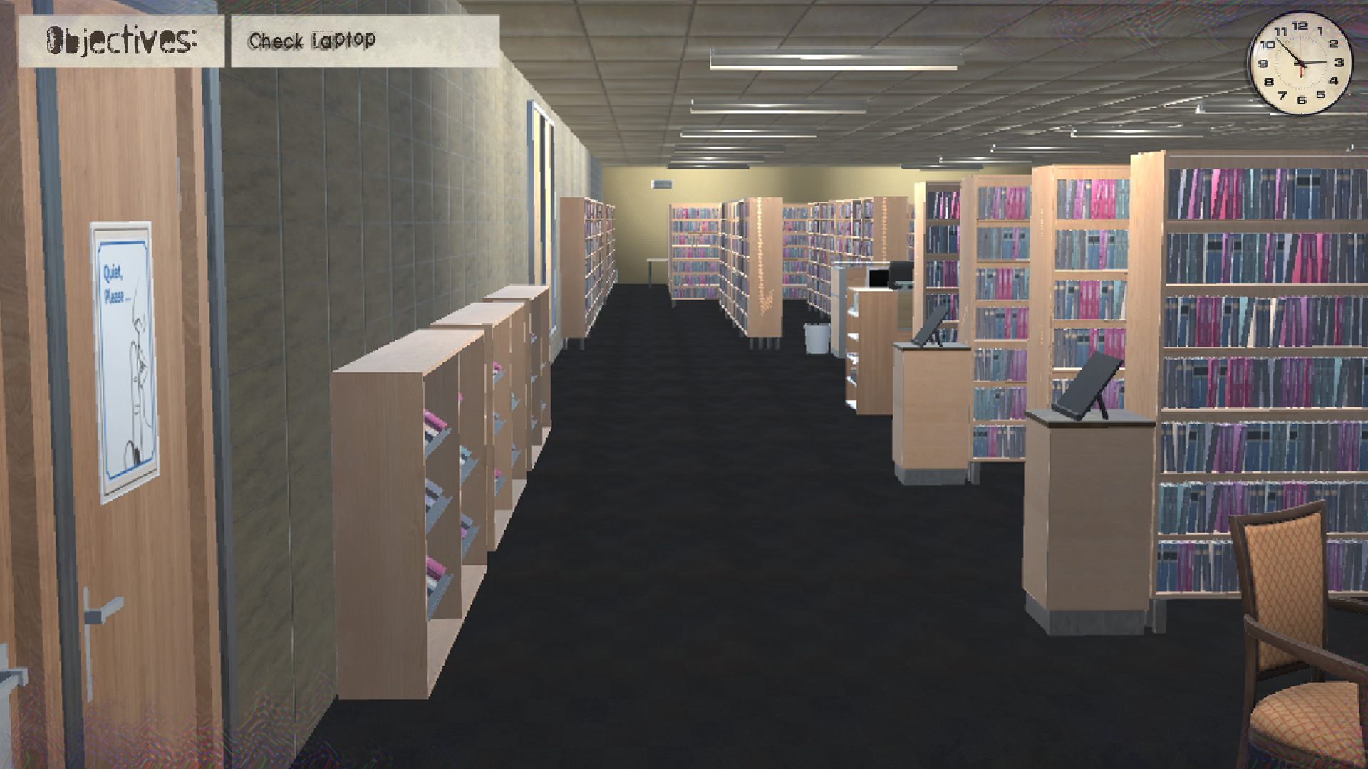
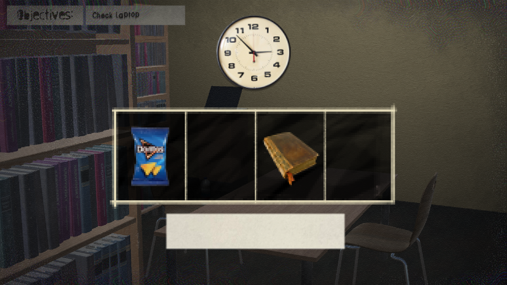
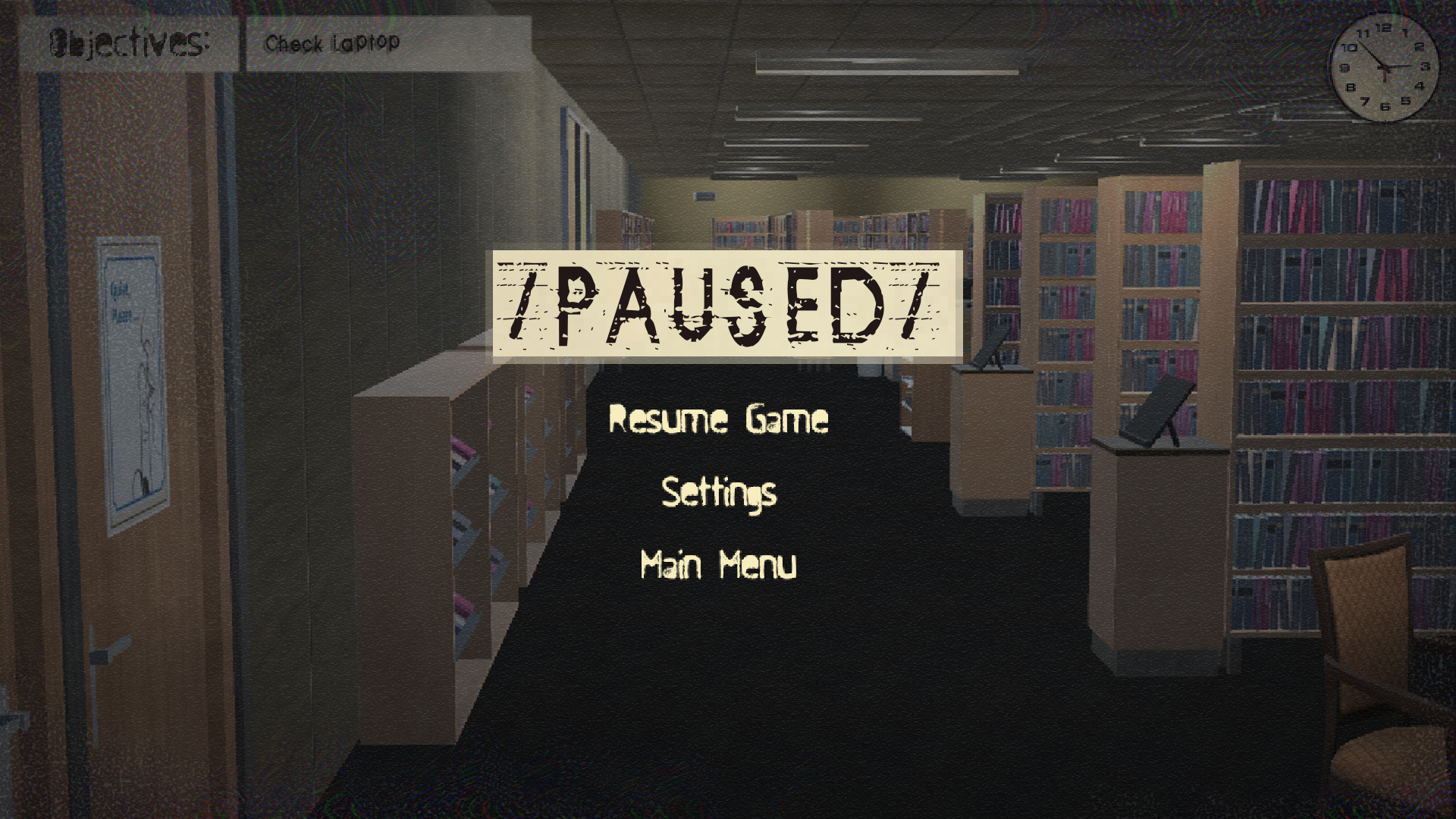
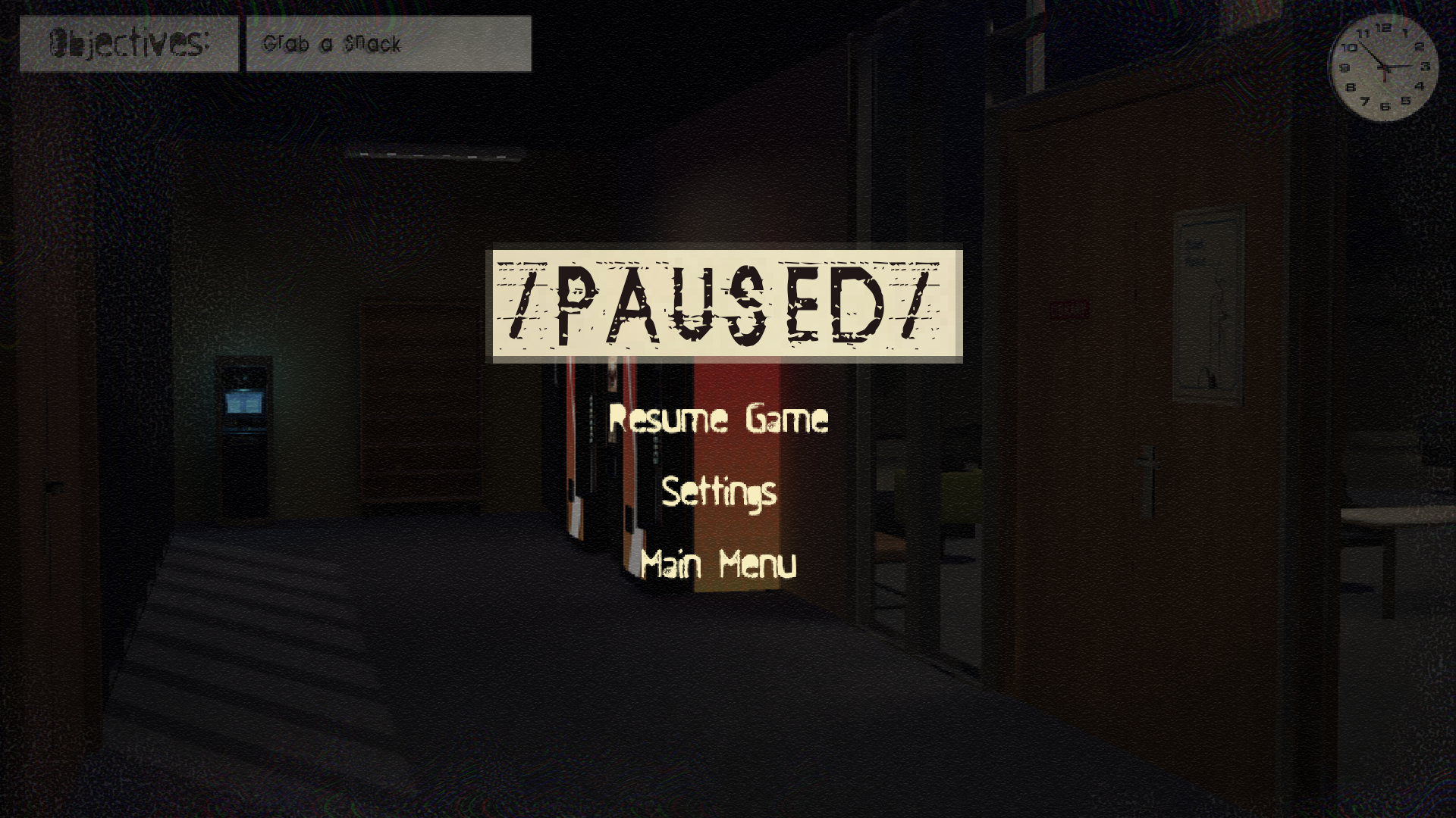
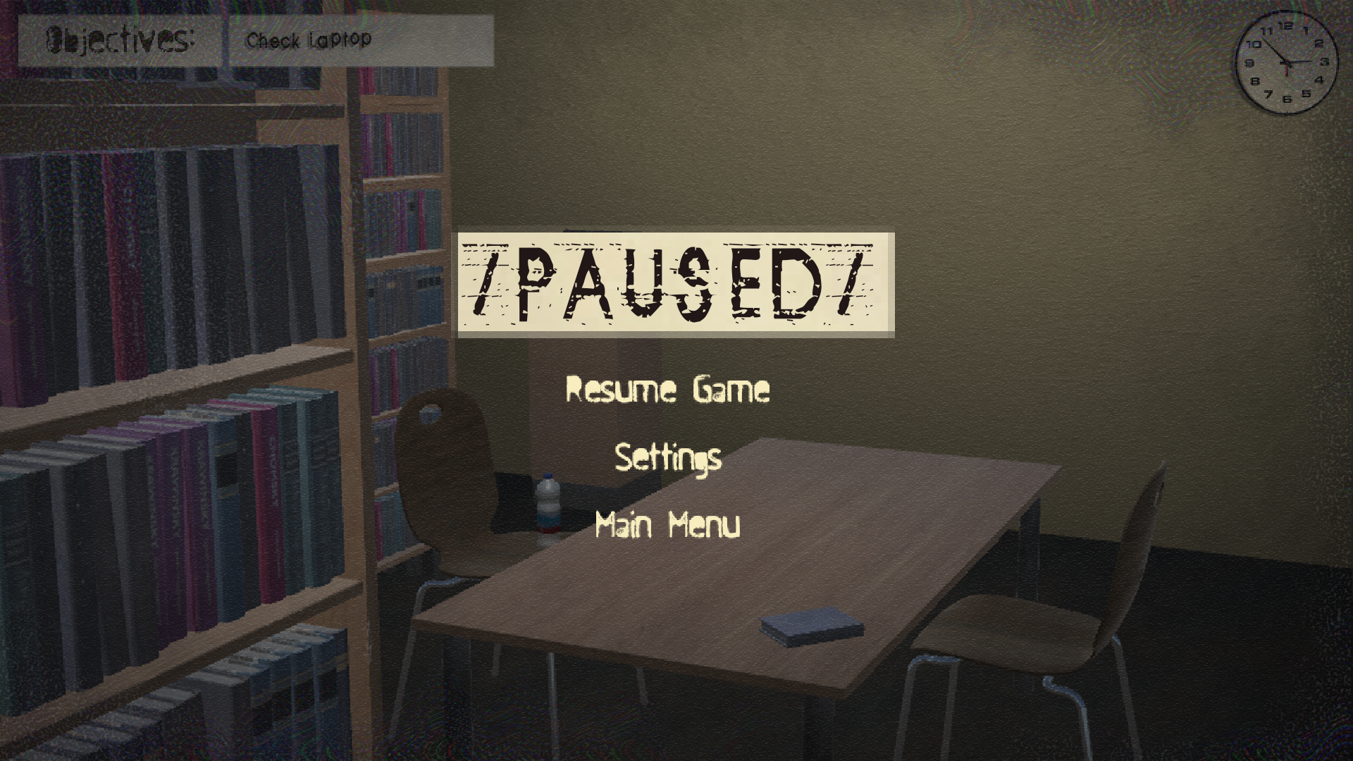
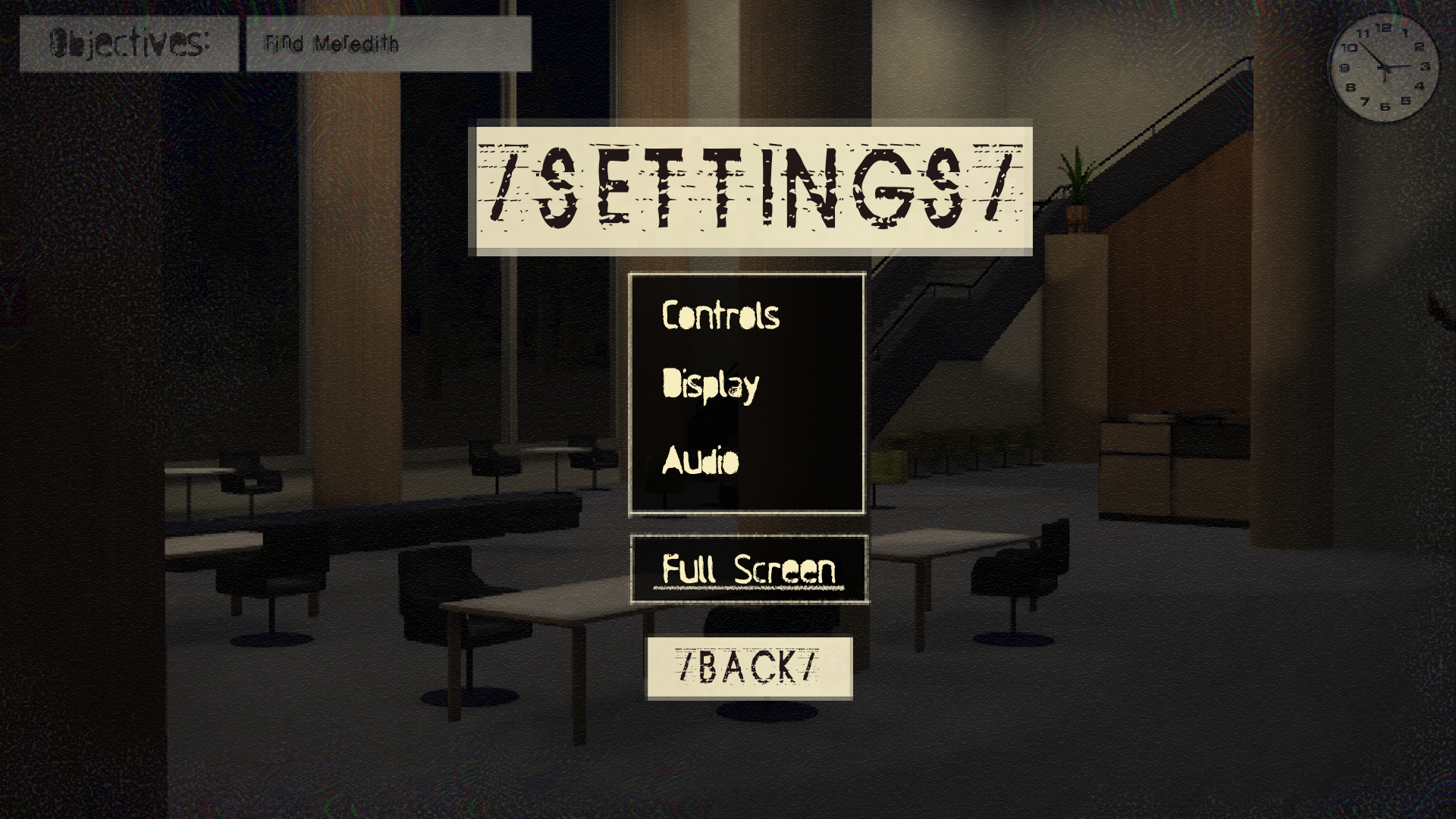
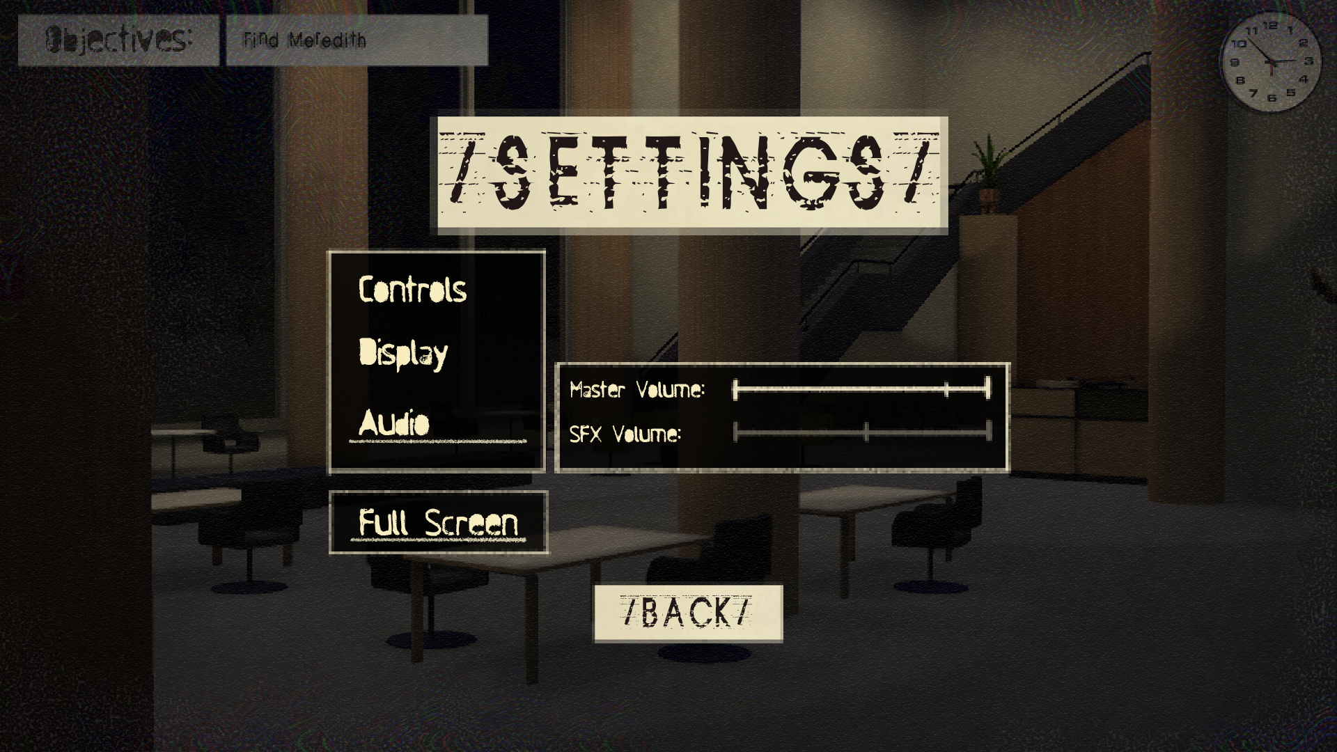
The most high traffic screens or “pages” for this preliminary exploration took priority. These were the gameplay, paused, settings, inventory, and title screens.
Some of these screens would, in reality, be expansions of other pages or be superimposed on top of the gameplay, but for the sake of wireframing were treated as separates.
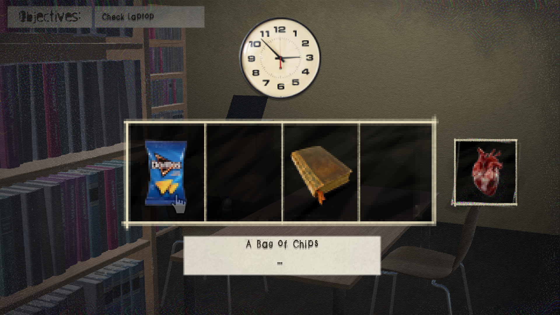
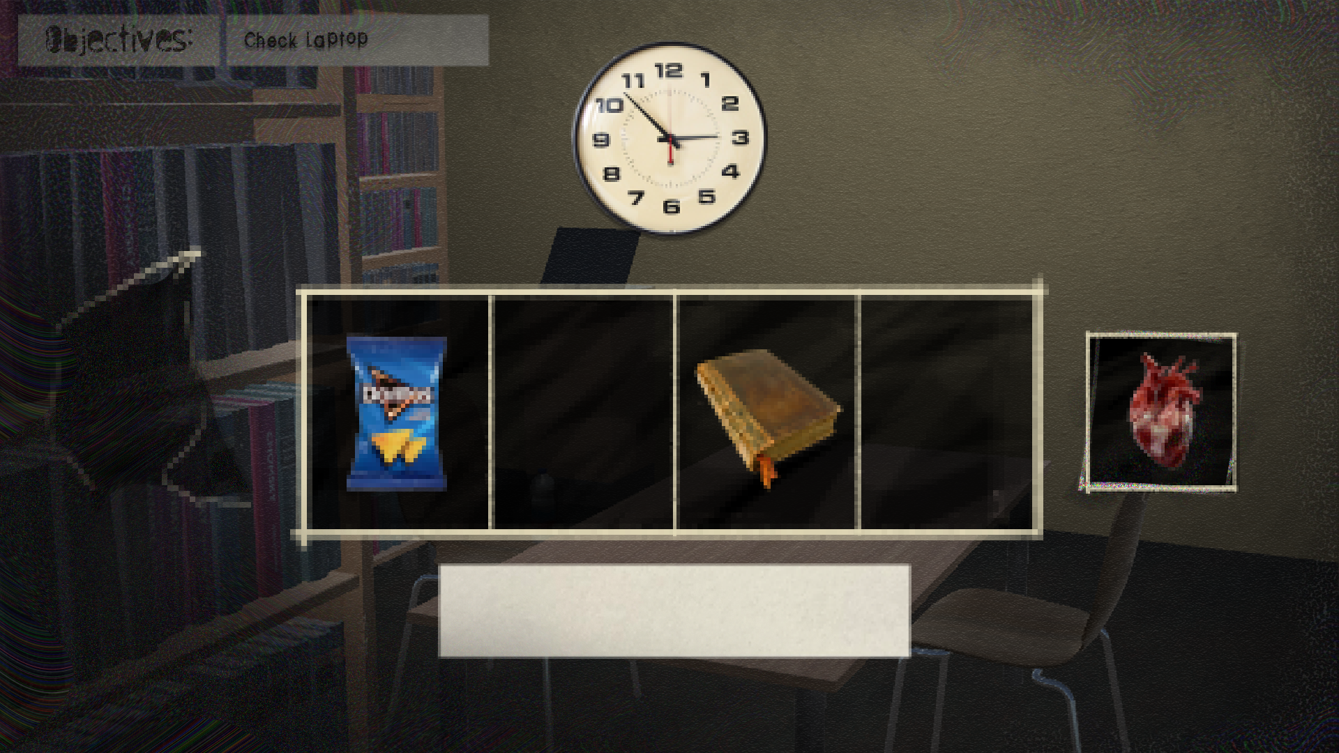
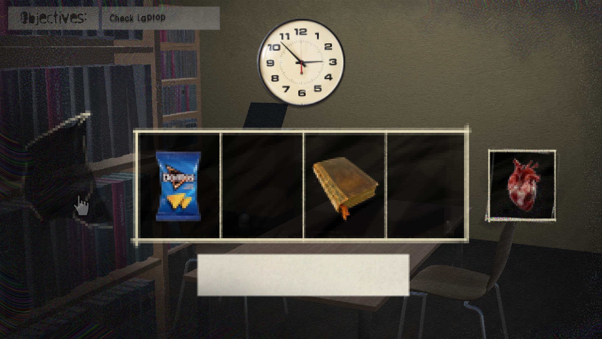
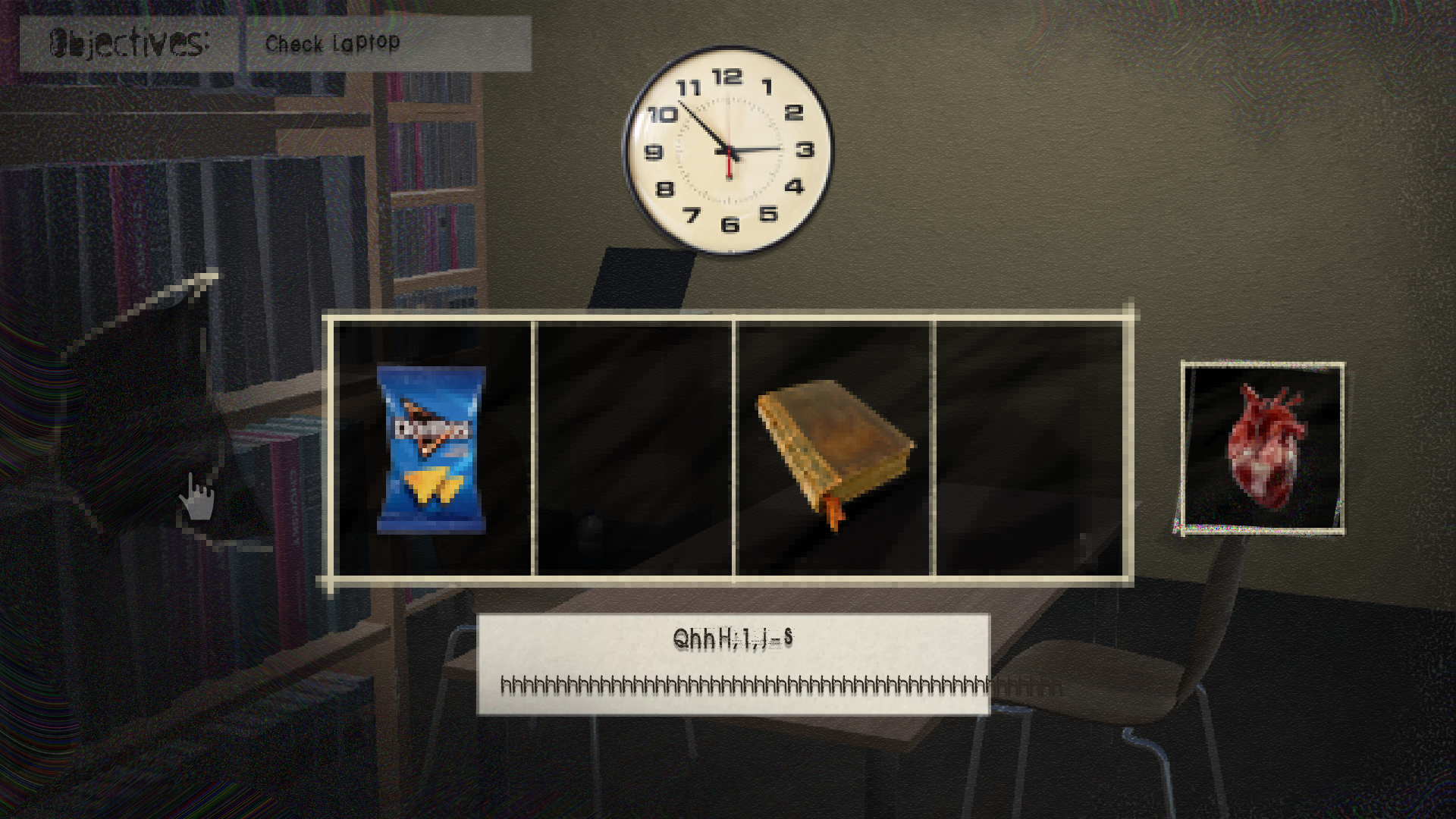
Next I jumped right into mocking up these screens like visual prototypes.
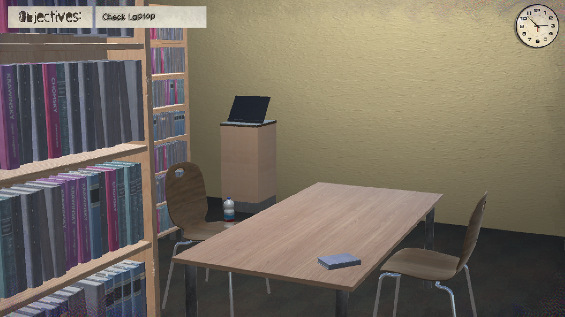
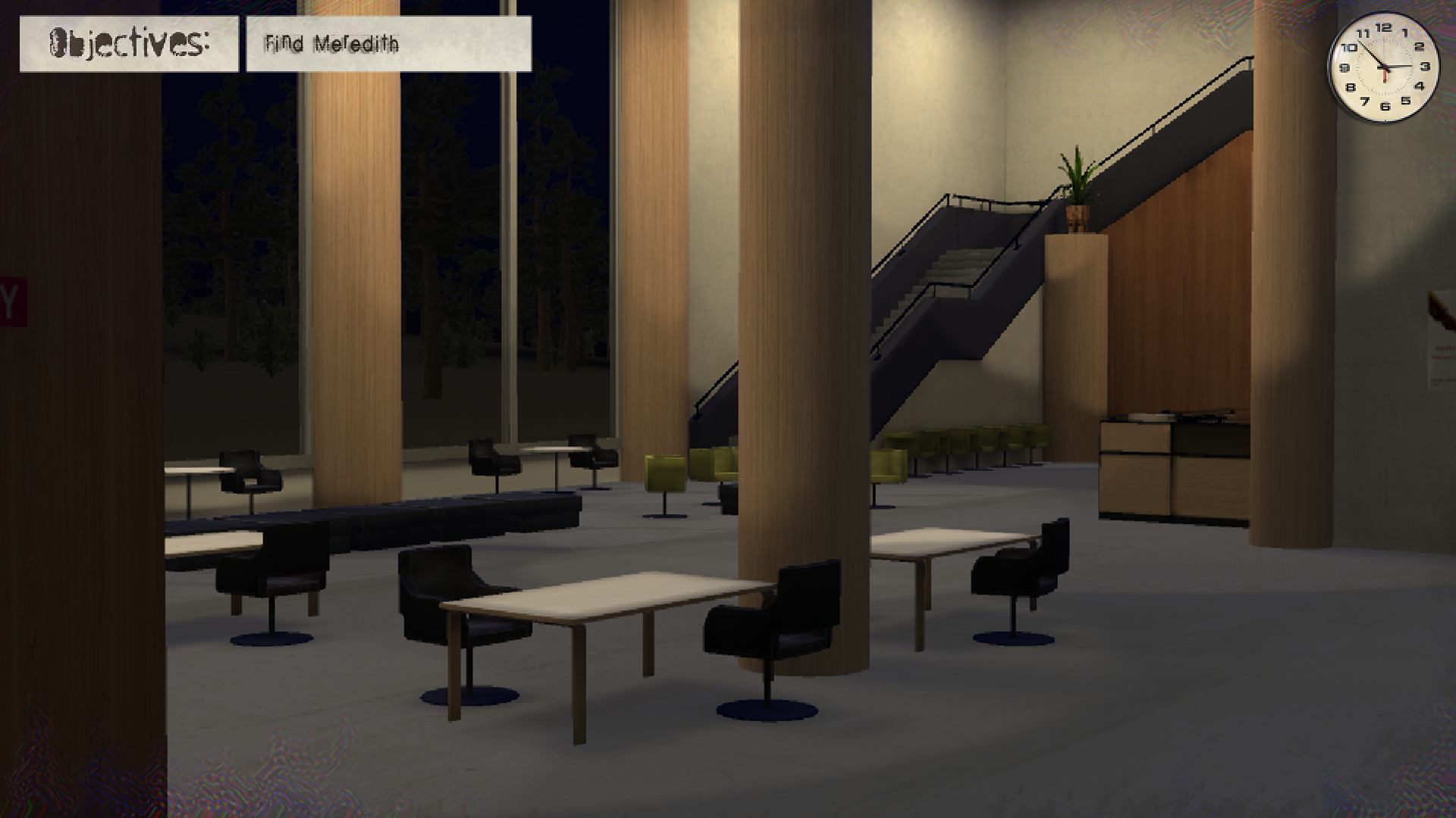
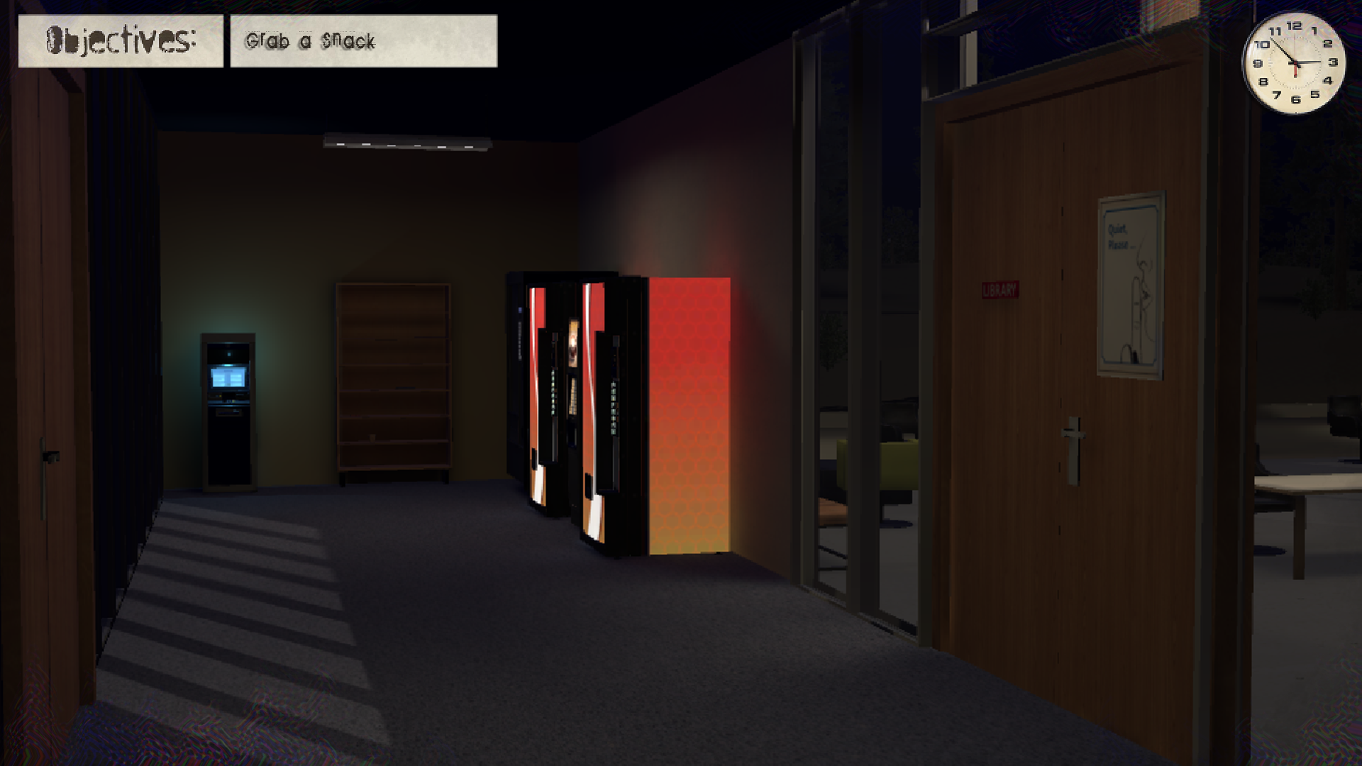
Using in-game renders as backing pictures, I was able to emulate the experience of a player viewing the game.
To create a cohesive visual identity, I used similar warping, pixelating, and noise effects to mimic the lower poly renderings of the gameplay. This as well adds to the narrative aesthetic of the environment slowly breaking down around the character.
Similarly, I created a design identity library of edited photos (i.e. clocks, inventory objects, etc.) and photoscans of printed copy. This was done to fit the nearly analog feel of the library.
Overall, the screens were kept simple and open and used an inked in or photocopied texture. This keep visual weight balanced and readable across the screen, while also keeping a cohesive look and feel.
